Image

Archive for artists

inspired by . Amelie Hegardt Fashion Art

20130319-152945.jpg

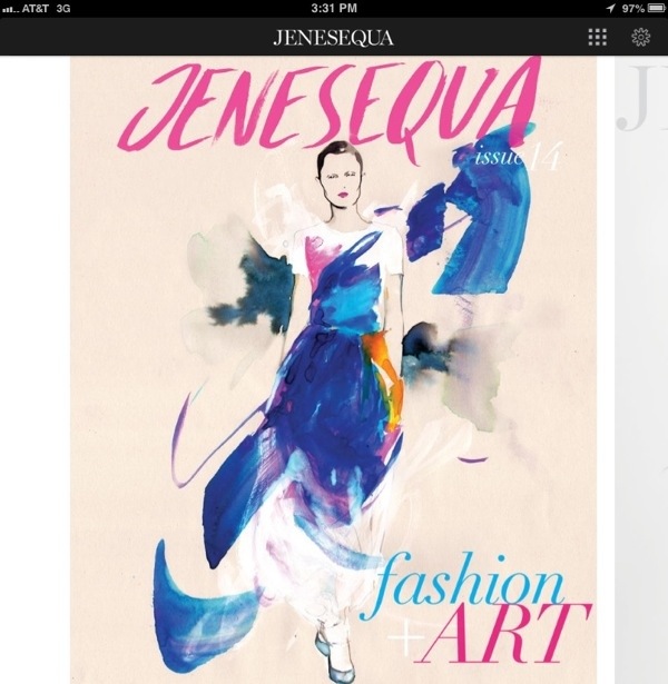
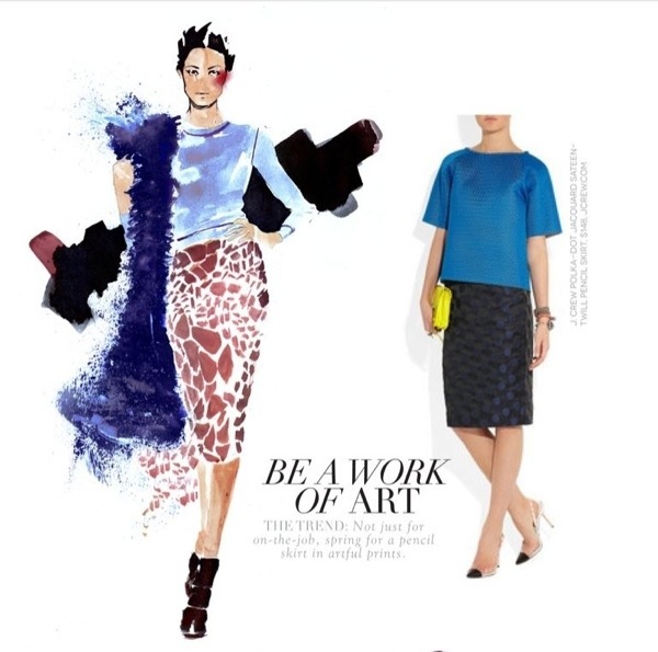
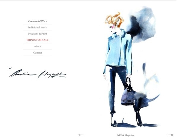
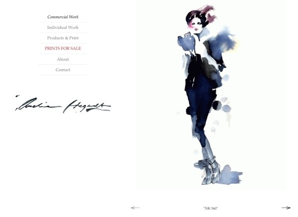
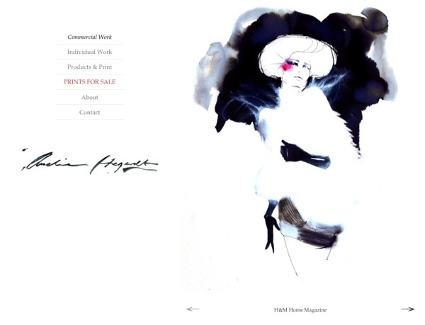
Last week during our down time, I was browsing some of the articles in the latest iPad issue of JENESEQUA. The watercolor and ink fashion illustrations from artist, Amelie Hegardt just took my breath away — especially her use of what art school called “negative space.” It is the areas in the composition that are left void where a part of the picture is implied through the shape of the white space. (That was your art lesson for the day! *grin*) I checked out Ms. Hegardt’s website to see more and I hope you enjoy some of the images I found.
20130319-153120.jpg

20130319-153256.jpg

20130319-153501.jpg

20130319-153839.jpg

20130319-155600.jpg

inspired by . Flower Constructions

Today, I’m really enjoying these “flower constructions” from artist, Anne ten Donkelaar. She had some other more vibrant constructions, but I was so struck by these more minimalist compositions. With flowers, it is so easy to focus on their color, but these  really highlight shapes and patterns. Ms. Donkelaar’s work is created from actual found objects from nature, photos, maps and other paper materials. I’m so stunned by their intricacy. Check out her website for her other types of constructions — all show such an admiration and understanding of nature, and the melding of nature with our lives. [The butterfly series is absolutely stunning, and maybe a little haunting.]

inspired by . Damien Hirst Spots

It was just a way of pinning down the joy of color.” ~Damien Hirst

I have to admit that in looking at Damien Hirst’s spot paintings, it’s still quite difficult to pin down the joy of color. It’s almost explosive. I was sifting through some of my browser bookmarks again and came across the online gallery of Hirst’s work in “The Complete Spot Paintings 1986–2011,” which was shown at the Gagosian Gallery simultaneously in all their locations earlier this year. [I really appreciate it when galleries offer an online version of some of their exhibits — very fun for a Mississippi girl!]

The Spot paintings are so simple — mostly spots of color in grids — but the “joy of color” as Hirst described it is very present. And, even though the grid formats may seem staid, that joy is still quite uncontained. In fact, the spots almost seem to be in constant motion with various shapes trying to emerge.

Seeing the photos again was a very refreshing reminder of the power (and joy) of color. See for yourself…

VIEW THE ONLINE EXHIBIT

inspired by . Chalk Lettering

I’m starting out the week completely amazed and inspired by the work of Dana Tanamachi, a custom chalk letterer and graphic designer. In this digital age, the drawing of letters is almost a lost art. But, I love the gritty and personal quality of these large-scale pieces. I love the whimsy inherent in conveying a message in the chalk medium. I also love the idea of possibly moving our digital tools in reverse — scoping out designs and messages in the digital sphere, and THEN translating that message back to a hand-wrought medium like chalk. [I think I may be gushing.] Be sure to check out the time-lapse video Dana made of the process of creating one of her pieces.

Ace Hotel Room 1021 from Dana Tanamachi on Vimeo.

inspired by . San Francisco in 100,000 Toothpicks

Take a look at this toothpick sculpture by Scott Weaver depicting San Francisco — complete with ping pong ball “tours” of the highlights. I couldn’t help but smile at the love of the Bay area that is evident in this labor of love. Not to mention the whimsical engineering feats!

Scott Weaver’s Rolling through the Bay from The Tinkering Studio on Vimeo.

[via likecool.com]

Divider Footer