Image

Archive for painting

favorite flânerie . Inspiration at Memphis’ Brooks Museum

I love the word flânerie and its meaning. One definition of this curious French word is aimless idleness, the act of strolling or dawdling. What a poetic name given to something that we so often criticize. When I think of the word dawdle, sadly, the first thing that comes to my mind is an impulse to hurry up one of my children in whatever task we’re trying to do. The idea of giving any attention to being aimless, to taking our time, to meandering from one thing to the next – on purpose – is pretty foreign to today’s culture. In a world where we seem to value being “driven”, and learn to focus on productivity at every younger ages, the notion of simply wandering or intentionally spending time with no purpose as become rare. Over the last year, I’ve challenged myself to try and recapture the forgotten art of flânerie, to leave time to go unplanned, to indulge the impulse to pull off the main road, or to ignore the admonition that we don’t have enough time. To see what we see.

A museum is a perfect place to dawdle. On a recent trip to Memphis, we took a few refreshing minutes to wander through the Brooks Museum of Art in Overton Park, and take in some of the collection. We’ve visited Memphis countless times, and always seemed not to have “enough time” to visit Brooks. On the last day of this trip, I credit my mom with saying, “you’ve been wanting to see it; so we should see it.” Decision made.

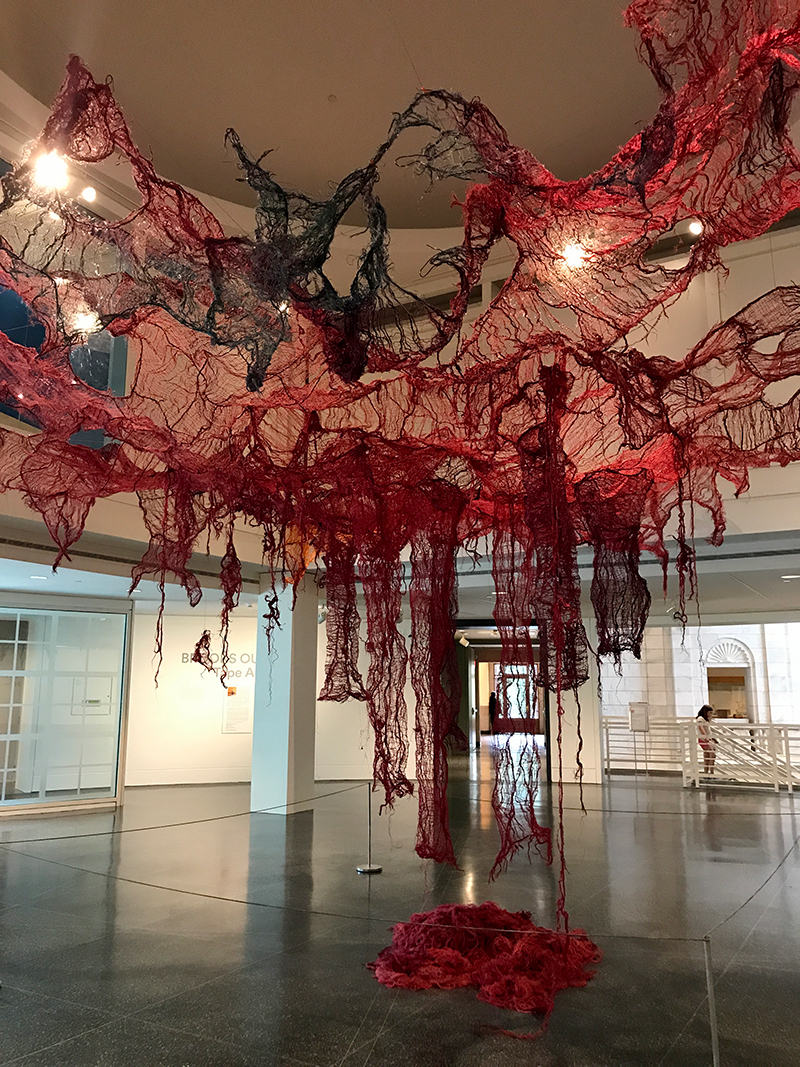
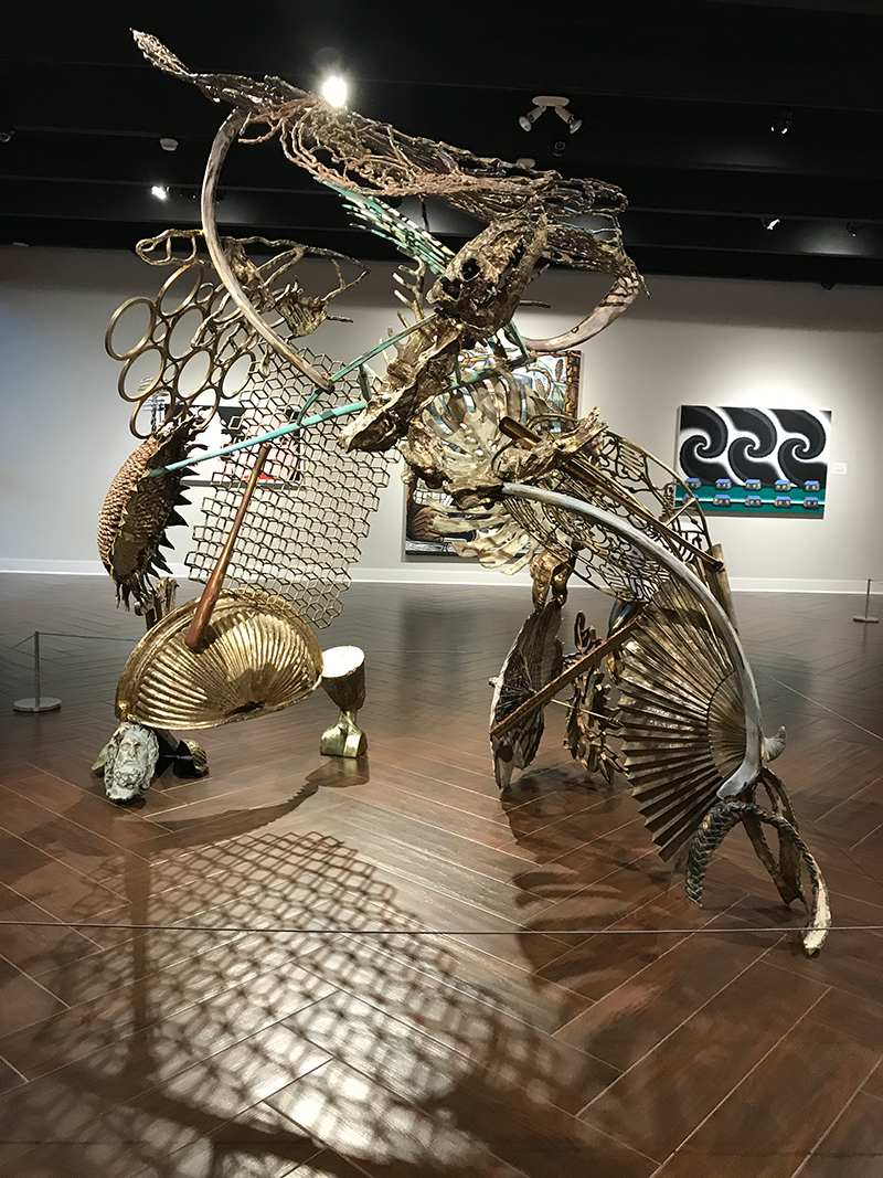
It was about an hour and a half before closing when we arrived at the museum, and even the docent told us, with a sigh, that the collection normally takes several hours to see. Still, the kids and I decided to wander anyway through Eggleston photographs, the uniquely Southern but sometimes otherworldly paintings of Carroll Cloar, contemporary Memphis-inspired works, and a visiting exhibit of American still life works which includes examples from Andrew Wyeth and Georgia O’Keefe. The museum’s collection is an eclectic combination of styles, mediums, and historical references from contemporary and modern works to decorative arts, internationally renown artists, and uniquely Southern work.

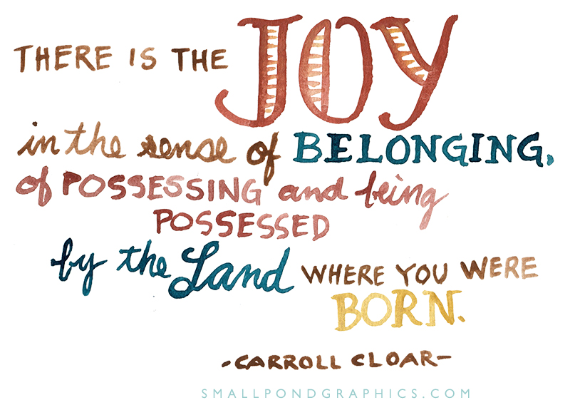
In the Cloar gallery, I jotted down one of his quotes… “There is the joy, in the sense of belonging, of possessing and being possessed, by the land where you were born.” As I was looking through images of artwork taken on our trip, it struck me that there is also a sense of belonging in the places we wander. The places we allow ourselves to absorb uninhibited by what we ought to be seeing, what we ought to be doing, where we ought to be going. These pieces, the emotions they evoke, and the familiarity they call to mind, are entwined in my mind with the look of the galleries as my children wandered them. The light on their faces next to the artwork. The ones they liked. The times they ran on ahead to find their favorites. Which were invariably different from mine. In that sense, these works belong to us. As well as to the Brooks.

Works portrayed in photos from the museum:

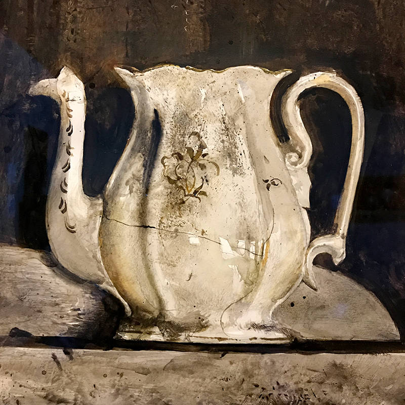
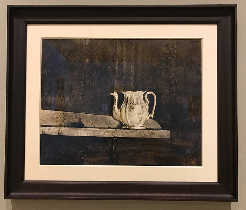
“Christina’s Teapot” 1968 — Andrew Wyeth
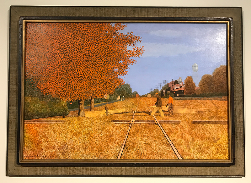
“Where the Southern Cross the Yellow Dog” 1965 — Carroll Cloar
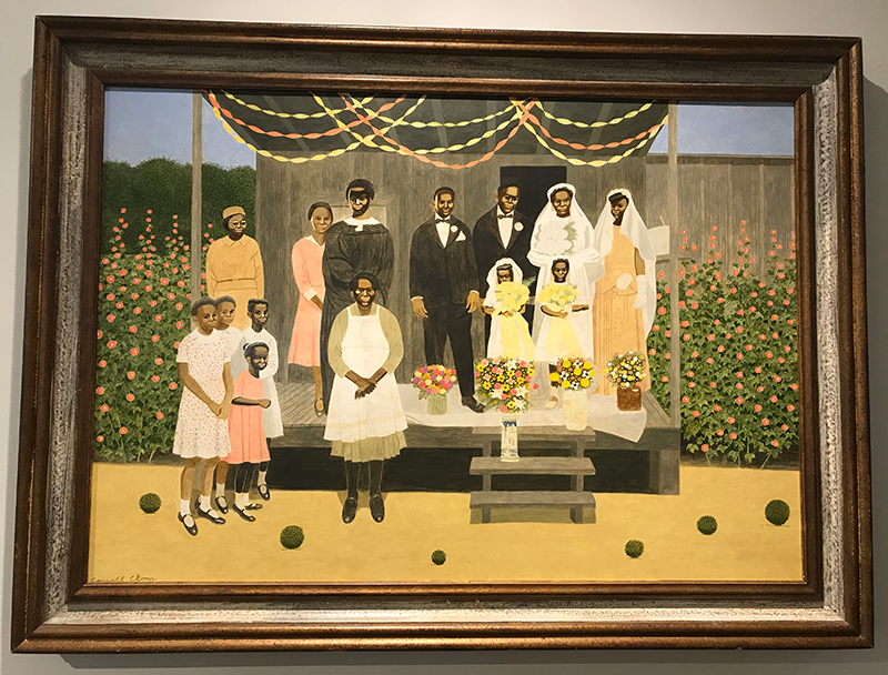
“Wedding Party” 1971 — Carroll Cloar
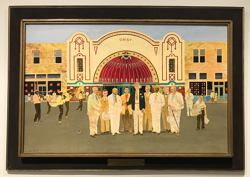
“Historic Encounter Between E.H. Crump and W.C. Handy on Beale Street” 1964 — Carroll Cloar
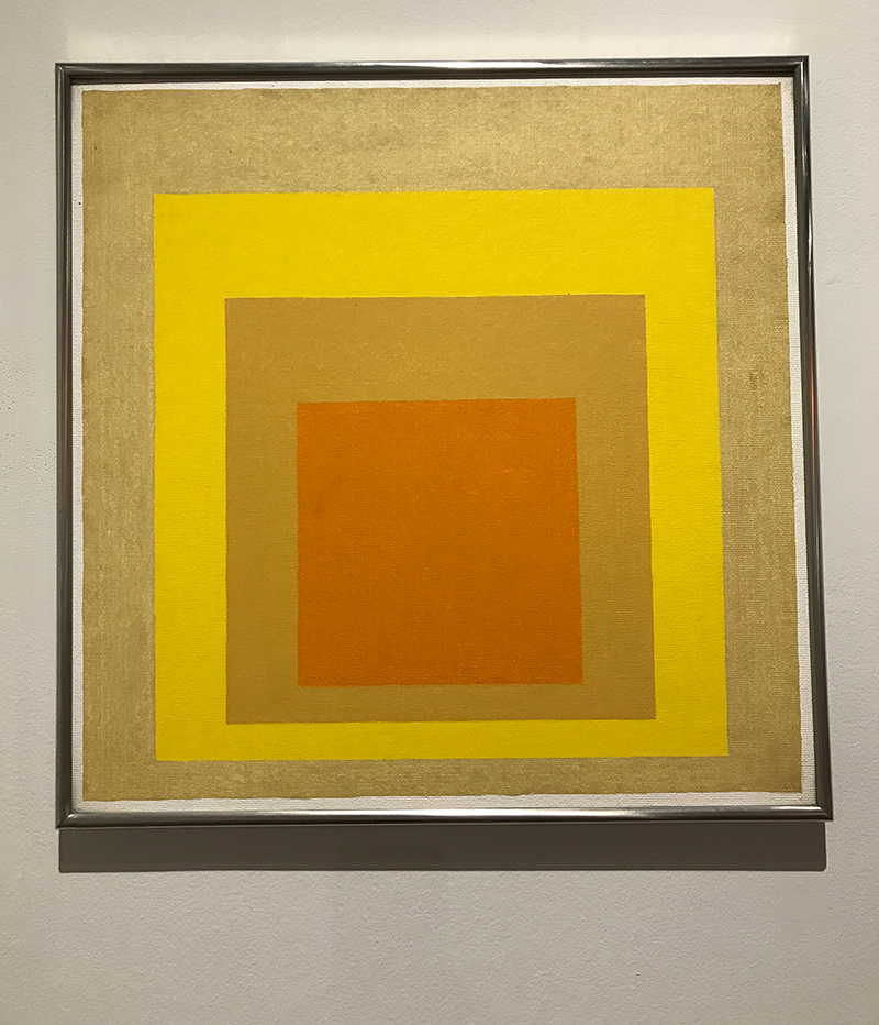
“Study for Homage to the Square: Young Voice” 1957 — Josef Albers
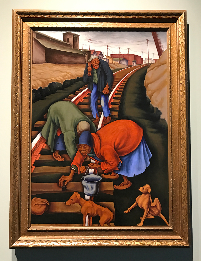
“The Gleaners” 1936 — Burton Callicott
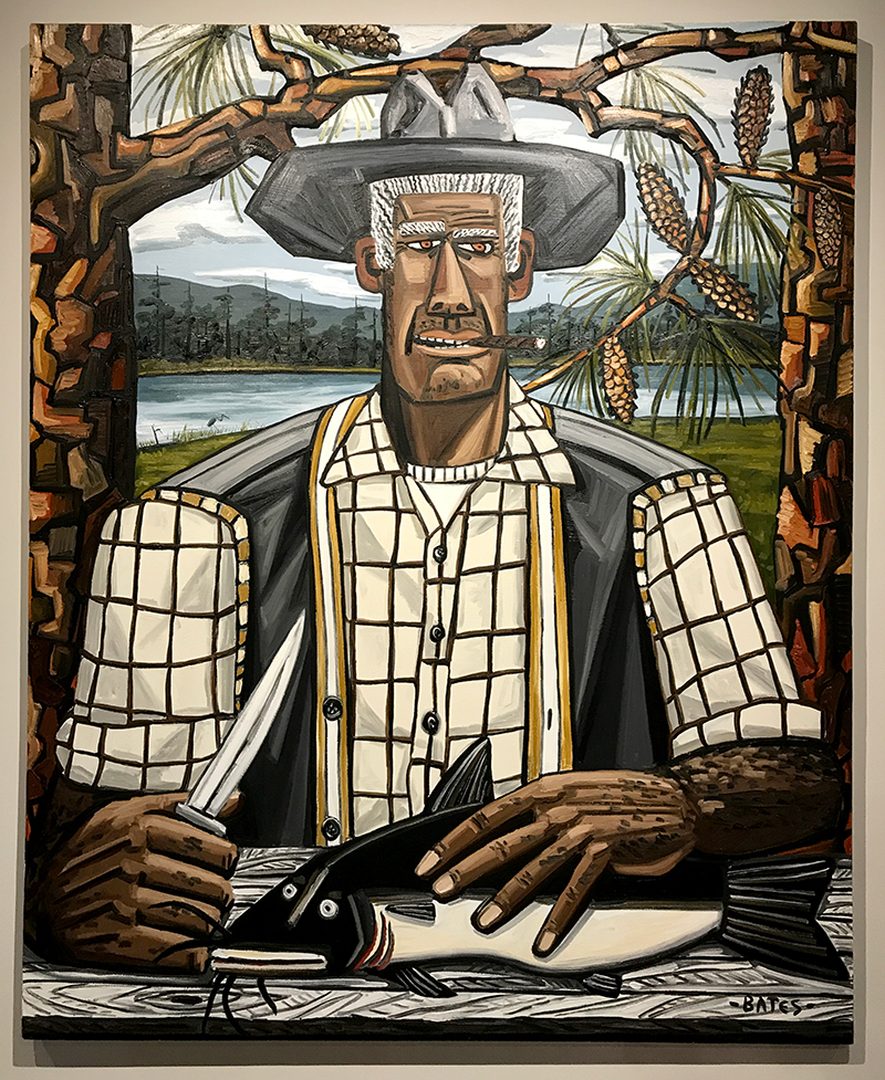
“The Cat Man” 1986 — David Bates
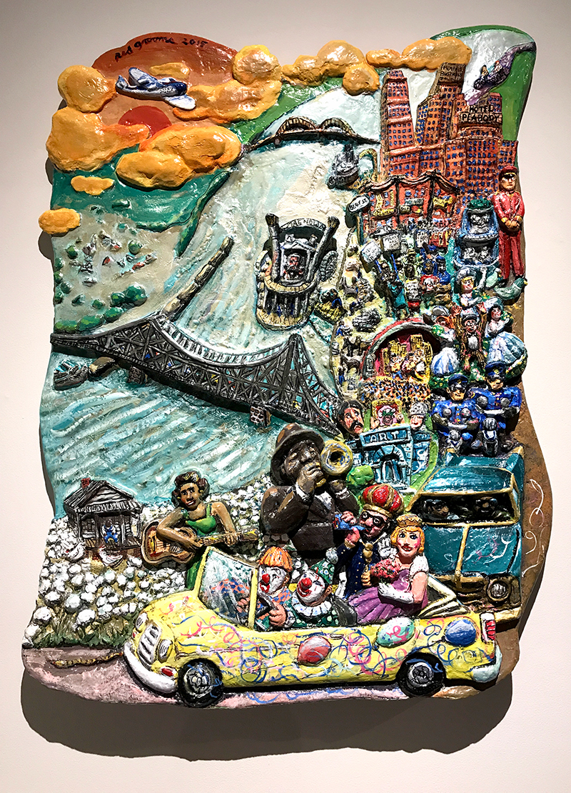
“Memphis On My Mind” 2015 — Red Grooms
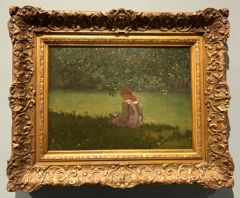
“Reading By The Brook” 1879 — Winslow Homer
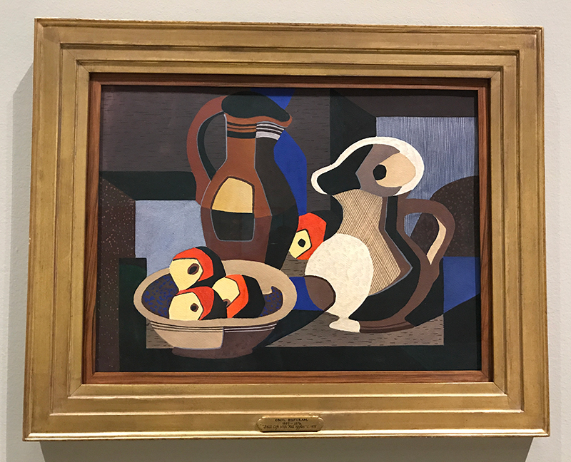
“Still Life with Red Apples” ca. 1935 — Emil James Bisttram


Watercolor Word Paintings

I’m excited to share some of the new things from my Etsy shop! If you’ve been following Plop! lately, you’ve probably noticed that I’ve been incorporating painting into my sketch journal process. Watercolor has been my painting medium of choice since I was in college, and lately I’ve enjoyed getting back into it — pairing it with some of the hand-drawn lettering that’s captured my interest. I’ve been working on a few watercolor “word paintings,” and I’ve decided to add my first prints to The Frog Kisser shop — available as 8 x 10″ and 11 x 14″! Here are a few I’m starting with. I hope you enjoy taking a look!

20130416-191412.jpg

20130416-191509.jpg

20130416-191546.jpg

20130416-191557.jpg

A Chalkboard Painting Project

20130114-090357.jpg

One of my monthly clients, Eat Cities, LLC, launched a new brand and online magazine at the beginning of January called Eat Y’all. A year in the making, the project aims to showcase food in the South as only Southerners can through great editorial content, the creation of food trails, and the production of exclusive Chef’s Table events giving diners the opportunity to interact with regional chefs. Yum! I’ve had the opportunity to work with Eat Y’all on their branding and marketing, which will soon include a new website. As part of their ongoing Chef’s Table series, they asked me to paint the logo on chalkboards to be used at the events. It was a fitting project for a Friday last week, and I thought I would share the process. Enjoy a peek! And, watch for details about Chef’s Table events in your region of the South. It’s an intimate Southern food experience you won’t want to miss!

20130114-085758.jpg 20130114-085845.jpg 20130114-085941.jpg 20130114-090018.jpg 20130114-090106.jpg

princely project . Branding in Unexpected Places

As delis go, Sweet Peppers Deli is a rock star. If you live in the Southeast, you may have had the opportunity to experience one of their restaurant franchises. The Sweet Peppers family includes 17 franchise- and company-owned stores now open in five states. Beyond their fresh approach to the deli concept and their sinful cookies, I have an affinity for the restaurant for two other reasons. Sweet Peppers Deli is the brain-child of two great restaurant companies launched right here where I live in north Mississippi. You can read all about their story here. I applaud any business offering excellent products from the rural deep South. Also, through my position at Dux D’Lux Advertising, I had the privilege of working with the folks at Sweet Peppers Deli in crafting their original brand image and extending it through many of it’s applications on-site and in advertising outlets. I’m honored that they chose to become one of my first clients after launching Small Pond Graphics as well.

I recently completed a painting project for the restaurant group, and it’s a great example of how this client is applying their brand in unexpected places. The Chattanooga, TN franchise is in the process of launching a breakfast line of high-quality coffee and other goodies, complete with a special in-store “coffee station.” The corporate office asked me to create some artwork to display behind the station as a focal point to highlight the coffee offerings and reinforce the brand in a sort of point-of-purchase application. Through a series of iterations, we settled on coffee cups and coffee beans paired with vibrant colors and a strategically placed Sweet Peppers Deli wordmark.

This set of three designs for the coffee station is actually an extension of a collection of paintings completed several years ago for the Sweet Peppers Deli franchise system as they were just getting off the ground. Faced with stores opening with very colorful, but blank walls, the team opted out of choosing the standard restaurant artwork warehouse fare. To their great branding credit, they saw these blank walls as an opportunity to provide the interiors with not only a unique look that was unmistakably “peppers”, but also a prime venue for highlighting the brand’s core value of  fresh ingredients and dynamic offerings. Through Dux D’Lux I produced a series of digitally printed canvases that were then overpainted with scattered brush strokes for a custom look. The paintings applied bright colors and whimsical brush strokes to various fruits and vegetables. They started as small cocktail napkin-sized acrylic paintings on fabric which were scanned at a large scale to emphasize their texture. The result was a series of wall art pieces that really make the table surroundings pop.

In addition to images of produce, I also developed painted versions of the brand’s two logo icons to be hung in-store as well. It was a great opportunity to see this well-developed brand translated into brush strokes — an unexpected and brand-reinforcing solution to the necessary picture-hanging. Kudos to Sweet Peppers Deli for knowing and understanding the importance of branding in unexpected places!

Divider Footer