
September is upon us. In Starkville, we are having cooler weather already–a little unusual for Mississippi. That transition is always nice after the heat and humidity of Summer. Those first few mornings when the breeze is actually cooler usually lift my spirits right away. I know I’ve shared that Autumn is my favorite time of year.
As I was deciding on a theme for this month’s desktop wallpaper calendar (click to download if you like), it occurred to me that often there is no other time when we more readily embrace transition than September. In fact, at this time of year we are sometimes even eager for the changes that come. As I mentioned, September brings the end of Summer’s heat and the first hints of more pleasant temperatures. It celebrates the beginning of a new school year for so many youngsters. It sets in motion the warming up of nature’s color palette as we begin to see subtle shifts in the blue of the sky and the fading of green on tree leaves. These transitions shake us out of the tired landscape where we’ve spent the summer.
In September, Summer’s luxuries of play and rest and taking breaks give way to renewed motivation to get back to the tasks at hand. We re-adjust our schedules with more focus. We outfit ourselves with new “necessities” that will spur us on to accomplish new things. We shake off the doldrums and attempt to get ourselves moving again.
I’ve written about the many changes that have been happening in my life over the last few months. Transition should be old hat to me by now. Yet, I find that the doldrums of complacency in my heart still need a little shaking free this month. So often, the heart moves at a different pace than the rest of us in making a transition. Sometimes it leads the charge. Sometimes it lags behind and needs a little coersion. Sometimes it just grows wayward in avoidance or denial. But, the realities of change and transition are just that. Realities. Just as surely as seasons come and go; the cycle of life changes can not be denied.
In thinking about the resistence I sometimes feel in my own heart when faced with transition, I was struck by one little line in the Wordsworth poem I included in my wallpaper design.
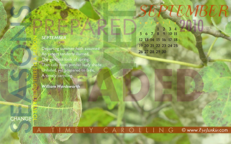
“Unfaded, yet prepared to fade”
That observation of September is so appropriate. Summer’s verdant colors still largely remain this month. The cooler temperatures reminiscent of Fall will be sporadic at best. Summer remains unfaded. Yet. [That’s a big word for only three letters.] YET, in September, Summer is “prepared” to fade. For in September, just as in any situation ripe for transition, you never know which season you’ll get moment by moment. At a breath’s notice, Summer and Autumn are just as likely to appear. Perhaps it’s nature’s way of coaxing us into the change.
It’s becoming more and more apparent that this particular season in my life is one of transition. I want my heart to be prepared. I want my heart to be ready to embrace it, to accept it, to shine through it. As chapters fade and new ones open, I want my heart on board. Completely.


