
sketch journal . 021013

 Font Crush alert! Lately I’ve been so enamored by the PORTAGOL ITC font. Stencil-type fonts aren’t always cool, but I love the narrow scale of this one and the uneven-ness of the lines. It just reminds me of literal hand-stenciling — hand-crafting, hand-built. That’s a lot to ask from a digital font ;). I used it this summer as part of this logo for a client’s Low Country-themed food and beer event, and I’ve been looking for excuses to use it ever since. [And I’m not above manufacturing an excuse!] If you’re looking for a look that’s crafty and earthy, mixed with a little grunge, this may be a good download.

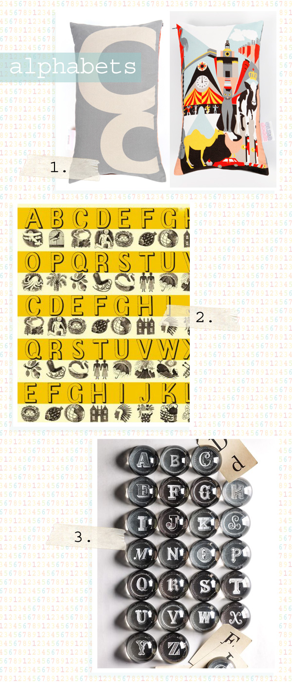

I’ve always loved alphabets — anything that depicts letters in a beautiful way, really. This weekend, I was sifting through the dark recesses of my bookmarks again and discovered these three examples.
Alphabets Collection No. 3
1. Elsie Dodds Alphabet cushions
2. Ben Pentreath LTD Alphabet wrapping paper
3. West Elm Alphabet paper weights featuring the chalk lettering work of Dana Tanamachi (which I love)
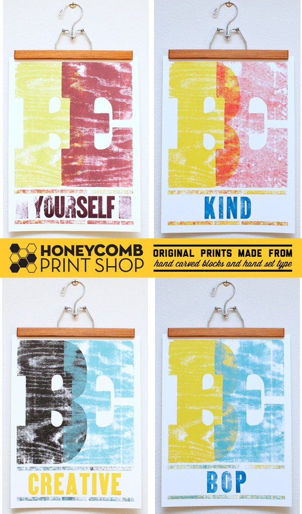

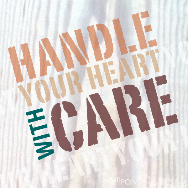
You know I’m a huge fan of hand-printed designs. I have fallen in love with the “BE” prints from Honeycomb Print Shop. These imperatives paired with bold type and bright colors make me want every one. And, you can even suggest a “be” phrase for printing!
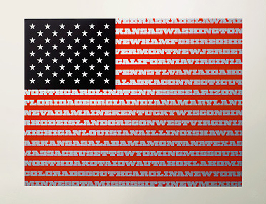

Happy Flag Day! The American flag is sort of a landmark of branding design, isn’t it? Bold, simple, representative of way more than the shapes comprising it, often evoking strong passion wherever it is depicted. Even when the shapes and forms are changed from the original, the simple message still remains.
I’ve always like this American flag print from House Industries (an American icon, in itself) featuring the Goliath font from Photo Lettering, Inc. American-drawn.